Dashboards are useful for displaying a variety of data visualizations in a single page similar to a web page. They can be used for creating story-telling interactions with data, for reporting on results over time, and for sharing data with partners, funders, and colleagues. Dashboards include widgets for displaying text, images, charts, maps, tables, calendars and more. Widgets are added and configured to display either static or live data from various data sources. The interactive interface allows users to click on widgets to display custom popups or drill down into the data. Dashboards can also be added to multipage interfaces under the Consoles tab.
Note: We recommend keeping each dashboard relatively compact, even
down to a single page without scrolling. This is good design practice
but also keeps performance fast. If you want to create many charts,
tables, and other widgets, consider spreading them out across multiple
dashboards in a console. Consoles are where you can combine any number
of maps, datagrids and dashboards.
Users vary widely in how they apply this feature to their programs. Some use it for blog-style posts and others create data consoles to
represent a large amount of complex information more simply. When you
build your dashboards in mWater, you can drive
real-time depictions of data with your forms and maps, such as this example here. Be sure to click on regions in the map to view the custom pop-up building capacity.
Video tutorial
Using the dashboard gallery
The dashboard gallery displays all dashboards visible to the user and can be found by clicking the Dashboards tab.
My Dashboards- Displays all dashboards created by the user.
Featured Dashboards- Displays all dashboards featured by mWater for training, case studies or resource articles.
Shared with Me- Displays all dashboards. shared with the user but not created by the user.
Public- Displays all dashboards shared where the View permissions are set to Public.
Search- Allows users to search for dashboards by their Name or Description.
Creating a new dashboard
Users can create as many dashboards as they need. New dashboards start as blank pages that are only shared with the user who created it.
In order to create a new dashboard:
From the mWater portal click on the Dashboards tab
In the dashboard gallery click Make a Dashboard.
In the dashboard builder click Save.
Give the new dashboard a Name and Description. The Name will be displayed in the dashboard gallery and the Description will be used for keyword searching for the dashboard.
Click Save. Now the new dashboard will appear in the dashboard gallery.
Duplicating an existing dashboard
Click on any dashboard.
Click Duplicate.
Click the new dashboard's name.
Change the new dashboard's name.
Click Save.
Note: Dashboard permissions are set separately from data source permissions (Surveys, sites, issues). This means that sharing a dashboard with a user does not share the source survey or site data with them. This will only give them access to the data as it appears in the dashboard, but not the raw data.
If a user duplicates a dashboard that refers to a data source that they don't have permission to view they will receive an error message. The administrator must then share the source data with the user before they can duplicate it.
Deleting an existing dashboard
WARNING DELETING A DASHBOARD IS PERMANENT AND CANNOT BE RETRIEVED.
Hover your cursor over the dashboard that you want to delete until it displays a blue boarder.
Click the X at the top.
A popup will appear asking if you are sure that you want to permanently delete the dashboard. Click OK.
Refreshing dashboards
If you want to ensure that your dashboard is showing the very latest data, please click the Refresh-button in the toolbar.
In order to strongly improve performance, dashboards are processed on the server and a cached version is provided by default. This makes loading even very complex dashboards much faster. The trade-off is that a dashboard may last have been refreshed up to 8 hours ago.
Note: Refreshing the browser page will not trigger a dashboard refresh of the data! It will only refresh the page and reload the cached version. So always click the refresh-button in the toolbar to get the very latest data. This is particularly useful in real-time use cases like survey response approvals.
Using the Dashboard builder
This page allows administrators of the dashboard to modify any aspect of the dashboard including adding or modifying widgets, changing the layout or settings, and sharing it with other users. To access the dashboard builder click the Edit button in the options menu.
An easy way to learn how to use the dashboard builder features is to duplicate an existing, public dashboard and play around with the widgets yourself.
Major sections of this page:
Dashboard name
Widget sidebar
Options menu
Dashboard body
Adding widgets to the dashboard
In edit mode, a sidebar of dashboard building
tools, or widgets appears. Drag widgets into the dashboard where you want them
by using your computer's click and drag mouse capability.
Resizing widgets
Widgets will default to full size or automatically resize depending where you put them in the dashboard.
There are three methods for resizing widgets:
Dragging the widget to a new location and mWater will automatically resize the widget.
2. Adjust the size of a widget by hovering over it, which will reveal a blue line indicating its size and a small,
3. Click and drag the double-sided arrow at the bottom of the widget
Title and Text widgets
Titles and text widgets can be used to display static or dynamic (live) text. The only difference between Title and Text is that Title is automatically formatted to large font size.
Formatting options:
Image widget
The image widget allows for a single image to be displayed in the dashboard at one time. This is distinct from the Mosaic widget which displays many images simultaneously.
Caption-Displays a caption above or below the photo.
Upload-Allows the user to upload a photo from their device
From Data-Displays a photo from any data source in mWater. The user must define the data source and photo question to reference for the photo. This allows users to display a different photo for each site or survey e.g. Water point (see photo below)
From URL- Displays a photo or GIF from a URL link outside of mWater Portal
Rotation-Allows users to rotate the image that was imported.
URL to open-When the widget is clicked the browser will open a new tab with this web page. This is useful for
Note: When using From Data, you will have to filter down to a single site or survey in order for the photo to appear. This is because the widget will only display a single image.
This is an example caption
Example of referencing a water point's Photo question in the image widget
Chart widget
Dashboards allows users to create various types of charts including Bar, Pie, Doughnut, Line, Smoothed Line, Scatter Plot, and Area charts. These charts can reference any data source in mWater that is shared with the user. Shown below are some of the basic chart types. For a more detailed description of charts widgets please visit this resource article.
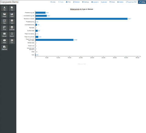
Basic Bar Chart
How to create this?
Basic Donut Chart
How to create this?
Basic Line Chart
How to create this?
Map widget
The map widget can be used to create multi-layered maps with layers including points, pipes, chloropleth (regions) maps, population density maps, grid maps, circle (radius) maps, cluster maps and custom tile layers via URL.
Basic point map (Water points)
How to create this?
Basic line map (Water pipes)
How to create this?
Basic chloropleth (color region) map
How to create this?
Table widget
A table widget allows users to display detailed data in a table of rows and columns. Each row represents a single site or survey and the columns represent the questions or data fields. The main distinction between tables and pivot tables is that tables present detailed data while pivot tables present summary data. For a more detailed description of the table widget visit this resource article.
There are several special functions available in tables:
Scrolling-The table can hold many rows which can be viewed via hovering the cursor over the table and scrolling.
Getting more details about a row of data-Each row can be clicked in order to access a popup with the full details of the site or survey.
Exporting-Data can be exported by hovering over the table, clicking the gear icon, and selecting Export Data.
Basic table widget
How to create this?
Pivot table widget
A table widget allows users to display summary data in a table of rows and columns. Each row can represent a single site or survey or an aggregate of many. Each column can also represent a single data field or an aggregate of many fields. The value of cells in the body of the table can represent totals, counts (number of), percentages and many more complex calculations. Many different sections can be added to a single pivot table to display various aspects or (dis)aggregations of the data.
The main distinction between tables and pivot tables is that tables present detailed data while pivot tables present summary data.
Calendar widgets allow users to track the number of sites or surveys created over time. Darker colored date boxes represent more sites or surveys. When hovering over a date a popup will display the date and number of sites or surveys completed on that date. The number of sites or surveys completed can be totaled by week, month, or year.
Basic Pivot table widget
How to create this?
Mosaic widget
Mosaic widgets allow users to display many photos simultaneously. These photos can be from an Image or Images question type. Clicking on the image will create a popup with the detailed data from the site or survey.
Basic mosaic widget
How to create this?
Spacer widget
Spacer widgets can be used to insert blank spaces that can be resized to format the dashboard.
Video widget
Video widgets allow for videos to be added to a dashboard via a URL link to the online video.
In order to add a video from youtube:
Go to the Youtube video
Right click on the video and select Copy Embed Code
Go to the mWater dashboard
Add a video widget to the dashboard
Click on the video widget and paste the embed code
The table of contents (TOC) allows users to insert a table of contents that is linked to different Headers and Subheaders in the dashboard. This allows users to quickly go to the appropriate section of the dashboard. Please refer to the TOC on the right and the instructions below. For a more detailed description visit this resource article.
In order to add a TOC widget:
Drag a TOC widget onto the dashboard.
Drag a Text widget onto the dashboard.
Add text into the text widget and highlight it.
In the formatting bar click H to make the text into a header. This will automatically add the text and a link to the Table of contents.
Slicer widget
Slicer widgets allow users to slice and filter other widgets. You can create slicers based on data columns, numerical values, dates / datetimes, and entirely custom options. Unlike quickfilters, which sit at the top of the dashboard, slicers can be placed wherever in the dashboard. You can also configure them between many options: Buttons, radio buttons, checkboxes and dropdowns for choice slicers, as well as ranges or sliders for numerical fields and dates.
User Slicers to improve interactability
Slicers are connected to each other. So if you have a slicer where the user chooses the Province, and have a second slicer with Districts, the Districts-slicer will narrow down to only show the relevant Districts.
Note: The Also filter other tables-options works similarly to merging quickfilters. This means that while a slicer will normally filter all widgets that are based on the same data source as the slicer, but if you point the slicer to the same data field in other data sources, then it will filter both.
For example: If you add a slicer on the Country of a school, you can then have the slicer also filter the Country field of a health facility.
Dashboard Sections
Sections act as sub-dashboards within a single dashboard tab. Instead of scrolling through a wall of data, you can categorize KPIs, charts, maps, and tables into distinct areas. This is particularly useful for complex projects with multiple KPIs, for example, the WASH in Schools dashboard shown below, where you might want to separate MHM from Sanitation or Hygiene.
Dashboard Sections demo
Key Benefits
Thematic Grouping: Keep related KPIs and charts together.
Performance Optimization: Sections can improve loading times by rendering data only for the active section.
Clean UI: Reduces dashboard fatigue by hiding non-essential information until opened.
How to Create and Manage Sections
When you first choose to organize your dashboard, you are presented with a high-level choice that determines how your data will appear. This setup interface is the foundation of your dashboard's user experience.
Single Page Layout
The Single Page option is the traditional approach to dashboard design.
How it works: All widgets, charts, and tables are placed on one continuous, vertically scrolling canvas.
Best for: Dashboards with a limited number of widgets (6–8 or fewer).
High-level executive summaries where all data is visible at a glance.
Linear storytelling where the user follows a specific narrative from top to bottom.
Multiple Sections Layout
The Multiple Sections option is the advanced choice for complex, data-heavy environments.
Best for: Comprehensive projects with many different metrics (e.g., separating Water, Sanitation, and Hygiene).
Improving page performance by only loading one section's data at a time.
Organizing data for different stakeholder groups within one dashboard.
Creating sections in a new dashboard
When you open a brand-new dashboard, the system will prompt you to choose your preferred style.
Select Multiple Sections:Note: This is the preferred choice for dashboards that will house many widgets or diverse thematic data.
Enter the Workspace: Once selected, you will be taken to a clean canvas. By default, your first section will be named Section 1.
Creating sections in a new dashboard
Open Section Editor
Click on the dropdown arrow located next to the default section name (e.g., Section 1) in the top-left corner.
From the context menu that appears, select Edit Sections....
In the configuration window that opens:
Click the + Add Section button to add a new section (which will default to Section 2), and you can rename it to your choosing.
Choose your preferred display style at the top of the modal window by selecting one of the available formatting layout tabs:
Tabs: Quick switching between 3–5 categories. This creates a clean, horizontal sub-menu.
Sidebar: Dashboards with many sections (7+). This provides a vertical list for easy scanning.
Accordion: Vertical stacking where users can expand one section while others collapse. Great for mobile.
Once your sections are added and your preferred layout style is selected, click the blue Save button in the bottom right corner of the window to apply the changes to your dashboard.
Splitting Content into New Sections
A powerful feature is the ability to "split" the dashboard's content to create a new section precisely where you need it. Identify the Split Point: Hover your cursor between two widgets or rows. A horizontal line with a plus icon and the text "Split section here" will appear. Clicking this line will split the current page at that exact point, moving everything below it into a brand-new section. This is perfect for when a single section becomes too long, and you realize halfway through that the bottom half of your charts belongs in a different thematic category (e.g., separating "Risk Scores" from "Facility Tables").
Splitting Content into New Sections
Editing sections in an existing multiple section dashboard
Editing sections in an existing dashboard
Navigate to the dashboard you wish to edit.
Click on the Edit button to enter edit mode.
Open the Settings tab.
In the settings view, select the Sections tab from the top navigation bar.
Adding and Naming Sections
Add a Section: Click the + Add Section button at the bottom of the list.
Naming: Click into the text field of a new section to give it a descriptive name (e.g., Schools Sanitation facilities Overview or Student Reach).
Reordering: Use the six-dot drag handle on the left of each section name to move it up or down in the priority list.
Deleting: Click the X on the far right of a section bar to remove it.
Switching from a single section dashboard to multiple section dashboard
Switching from a single section dashboard to multiple section dashboard
If you have a large, single-page dashboard, you can easily convert it into a multiple-section layout.
Open the dashboard you wish to convert.
Click the Settings icon (gear symbol) in the top-right toolbar.
In the configuration menu that appears, select the Sections tab.
When you first enter the Sections tab on a standard dashboard, you will see a message stating that you are currently using a single page.
Click the blue button labeled Switch to multiple sections.
The interface will immediately change to show a list of sections, starting with your current content grouped into "Section 1."
Combining Sections
If you decide that a segmented view isn't working, you don't have to delete everything.
Click Combine sections into a single page... at the bottom of the Sections menu.
This will merge all content into one continuous scrolling view, effectively removing the sub-tab structure while keeping your visualizations intact.
Clipboard function
The clipboard function allows users to copy and paste widgets within a dashboard or to another dashboard. For more details on this function please see this resource article.
You can copy any widget (chart, map, pivot table etc.) in any dashboard which you are an admin of with these steps:
Copy
1) Enter Edit mode from the top right
2) Drag the widget from the top left corner where the move control is onto the Clipboard element of the palette on the left.
3) Release the widget over the clipboard.
Paste
The widget is now copied on the clipboard. You can paste a widget now by dragging the clipboard widget onto the canvas. You can position it similarly to any other widget.
The clipboard is shared between any tabs and windows you have open. This means that you can copy a widget on the clipboard in one dashboard and paste it in another. Once you have pasted the widget on the clipboard, just drag it from the clipboard on the target dashboard or console.
To copy and paste a widget drag it to the Clipboard widget in the palette
Drilldowns
You can make your dashboards more interactive by adding drilldowns to map layers, charts, tables, pivot tables, and calendar widgets. This means that once a user click an element such as a region on a map, a bar in a bar chart, or a cell in a pivot table, they get taken to a focus view in the same dashboard that has different widgets and is filtered to that region, bar, or cell's data.
Examples:
Build a drilldown from a national level down to regions, districts, and even individual sites.
Go from overall KPIs to disaggregations by age, gender, location.
Have a timeline bar chart and allow zooming into the details of each year by clicking the year's bar.
The basic use is simple: Create a drilldown that contains the widgets that will show when a user drills down into that view. You can create new drilldowns either from a widget or from the dashboard's settings tab. Widgets in drilldowns are created just like widgets in the regular dashboard.
Next, edit your widget in the dashboard and connect it to the view. You can choose between different actions that happen when a data series is clicked: Filtering the page, opening a drilldown, opening the row if it is a standard data type like a site or response, or doing nothing. In map layers you can also open a popup.
Then you select which drilldown should open when the widget is clicked. The system will automatically filter your data by that selection. Note that if your focus view contains more data sources than the one shared with the widget, then you can also optionally connect those other data source. If you do, then they will also filter when drilling down.
Map layer controls for a drill-through
When you have added drilldowns, you can switch between the dashboard
view and any drilldown when you are in Edit mode by selecting the drilldown from the bottom of the left-side palette.
Color blind friendly visuals
How color-blind users may perceive the colors in your charts:
If you are color-coding any of your visuals, it is good to bear in mind that a noticeable proportion of people viewing it may see the visual differently if they have some type of color-blindness. This may cause confusion and blur the distinctions between different categories. So it is worth paying attention to the accessibility of your charts, maps and colors.
The standard color schemes mWater offers are relatively color-blind friendly, so we recommend using them as a starting point:
To test whether your visualization is color-blind friendly, you can use a free color blindness simulator such as https://www.color-blindness.com/coblis-color-blindness-simulator/ to upload a screenshot or image of your visual and see how it would appear to individuals with various types of color blindness.
The Options menu contains general dashboard management functions.
Undo-While in Edit mode, this will undo the last modification made to the dashboard.
Redo-While in Edit mode, if an action was undone, clicking this button will redo the action.
Print-Prints the dashboard body without menu bars.
Refresh-Reloads the data in the dashboard. This is quicker than reloading the page.
Settings-While in Edit mode, allows administrators to set Filter and Language preferences.
Layout-Changes the page layout of the dashboard.
Duplicate-Creates a copy of the dashboard and sets the user as administrator of the copy.
Share-Allows the administrator to share the dashboard with mWater users or via an open share link.
Gallery-Returns to the Dashboard Gallery page.
Export as PDF-Prints the body of the dashboard as a PDF. This will not include the browser window or the Portal menu bars.
Edit/Editing-Toggles between edit and view mode. Only administrators of the dashboard have access to this button.
Settings
The Setting button allows users to apply various types of filters and choose the language of the dashboard text.
Quick Filters-Allow the administrator to set up drop-down filters which will be displayed for users at the top of the dashboard. These can filter a single data source or be combined to filter many data sources at once.
Filters-Allows the administrator to set up filters that the dashboard users cannot change. These are set individually for each data source.
Global Filters-Allows the administrator to apply Geographic or Managed by filters that apply to all Sites displayed on the dashboard.
Language- If a survey has been translated into a language via the Surveys>Translate tab, changing this setting will automatically translate the survey text on the dashboard. This includes survey questions and choices. When using Sites as a data source, only the languages that have been translated in the mWater Surveyor app will support translation. If you would like to add your language to this list please contact info@mwater.co.
Share a dashboard
At any point after
saving a dashboard you can share it with others for either assistance in
editing or viewing a completed version. Note that
simultaneous editing of a dashboard is not possible. It will result in losing
content between the two versions open to edit mode.
There are three ways to share dashboards:
Add Users: In the Share button (located in
small blue letters at the top right), you view options to share with
mWater users as Admin or Viewers. Admins can edit or delete
the dashboard. Viewers can open the dashboard but not change it. Both need to
have View access to the underlying data in order to view the dashboard in this
mode.
Share Link: You can also share the dashboard
with non-mWater users and users who may not have View access
to the underlying data by clicking on Create link in the Share popup. Anyone
can open this link in their web browser without logging in. They won't be able
to change the options or see any other data not included in the dashboard.
Filtered Share Link: For advanced users who
have applied quick filters to their dashboard, you can also create a filtered
share link. Anyone opening this link will see a lock icon next to the quick
filter that you set and they will not remove or change that filter. This may
help users who have one dashboard for different partners share a view that is
filtered to show only that partner's data. You can create any number of
filtered share links and delete them when they are no longer needed.
Choosing a page themes
Three layout options are available to make your dashboards and data storytelling pages look great on any device. You can change any of your current dashboards to one of the new layouts. Just click on the Layout menu to try out the new options.
Click on the Layout menu to change styles
Since we introduced our new dashboard editor, everyone at mWater has been using the new feature for everything from online manualsonline manuals to sharing how our partners use mWater in their data-driven programs. We also learned a lot from watching our power users create their own dashboards.
All of this research led us to create three different default styles of dashboards:
Framed - this works like the Classic design, but has a grey background with white widgets so that the graphs look a bit like gauges on a control panel. This draws attention to the graphs and puts everything into frames with smooth borders.
Story - our most exciting new development, the story layout has larger text, a fixed width, and is responsive, meaning that the text and widgets automatically resize and reorder themselves to fit any size of screen. The post you are reading now is using the Story layout.
Classic - great for making clean poster-like displays of data on a white background. Graphs and text don't have visible borders and the widgets expand to fit the full width of any display. This kind of dashboard has a minimum size, so if you view it on small screens (tablets and phones) it will allow you to scroll left and right to see everything.
We've included some screenshots of each style below. You can always duplicate a dashboard that you like to see how it works or to substitute your own data.
From 2024 onwards, users can also extensively customize the look and feel of dashboards by adjusting a number of layout parameters.
With these new options you can adjust the font type and size for various elements of your dashboard such as titles, headings and charts. You can also change the padding in and between widget blocks, as well as set the background color of your blocks and the entire dashboard.
If you create a theme you want to use in other dashboards, you can also easily download your configuration and then upload it into another dashboard to apply the same settings.